
Bro-To Skincare
Simple, reliable, effective skin care.
Scope –
Art Direction
Casting
Brand Identity Refresh
Digital Design
Packaging
Print
Production
Social Media
Website
-
This included the brand identity, packaging design, art direction, campaign and website. Bro-To relaunched in 2020 with bold lava and aqua packaging, with its own website and style guide. Australian model Nathan McGuire embodied the playful energy of Bro-To and was cast as the main face of the campaign.
Additionally, this relaunch hallmarked the beginning of the Go-To company's sustainable packaging initiative.
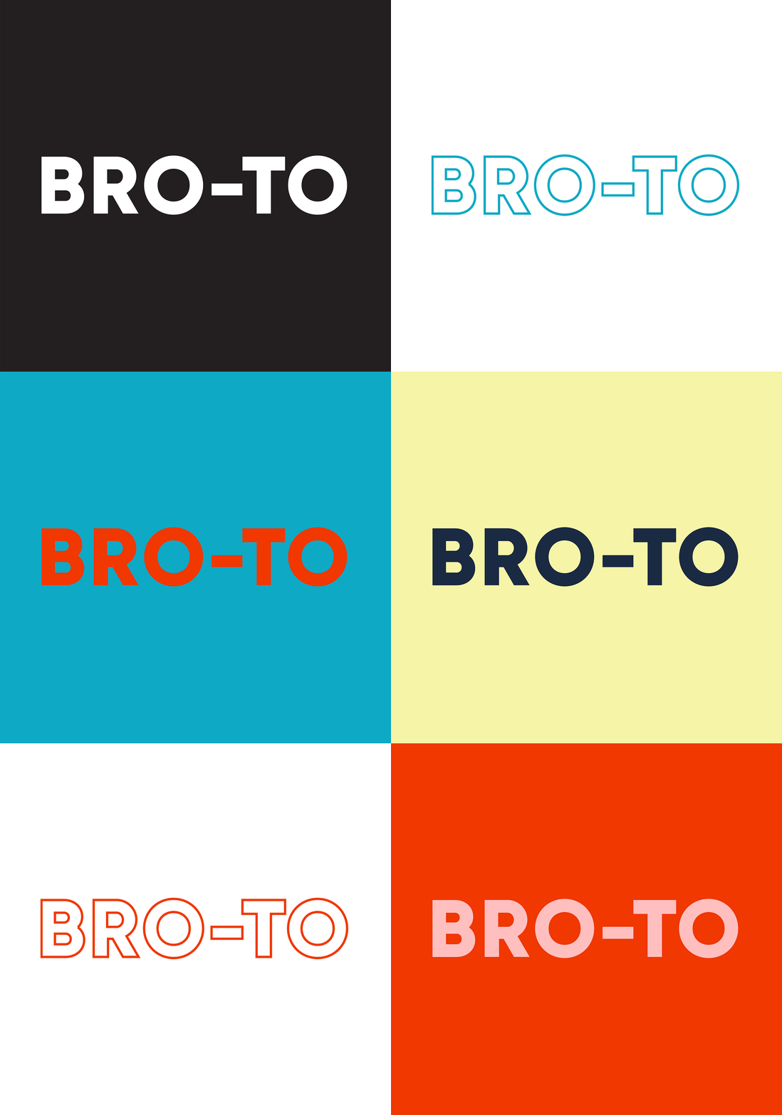

What do i have to say about the logo, fonts and colours? hmm.
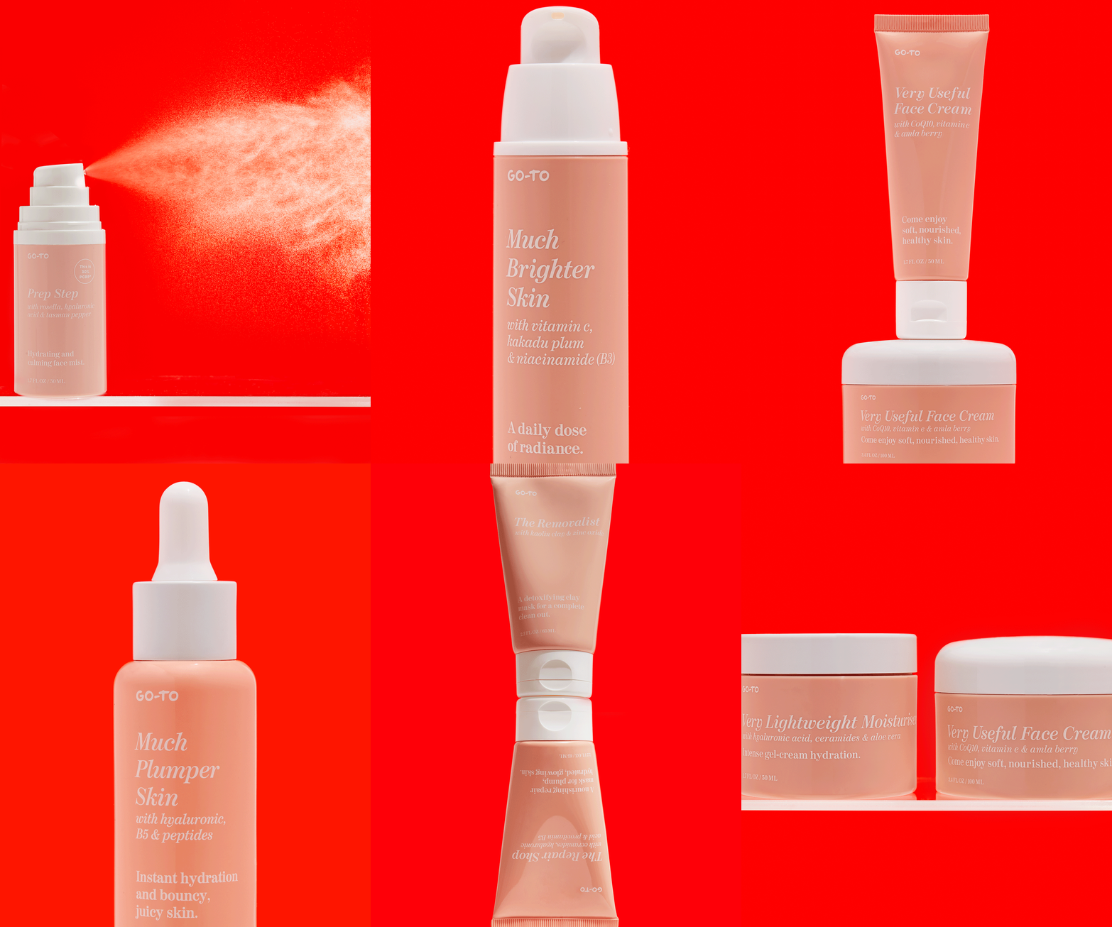
The packaging also had a facelift. New fonts, updated peach shade, product vessels updated, new design for the copy and new cartons designs.


The imagery suite included product swatches; product imagery for ecommerce purposes; dynamic product imagery for all other communications purposes — including the ‘messy product shots’ and ‘hands holding products’ (which are now a recognisable part of the Go-To DNA); and evergreen model imagery — always with the intention to use a diverse range of talent and skin conditions.

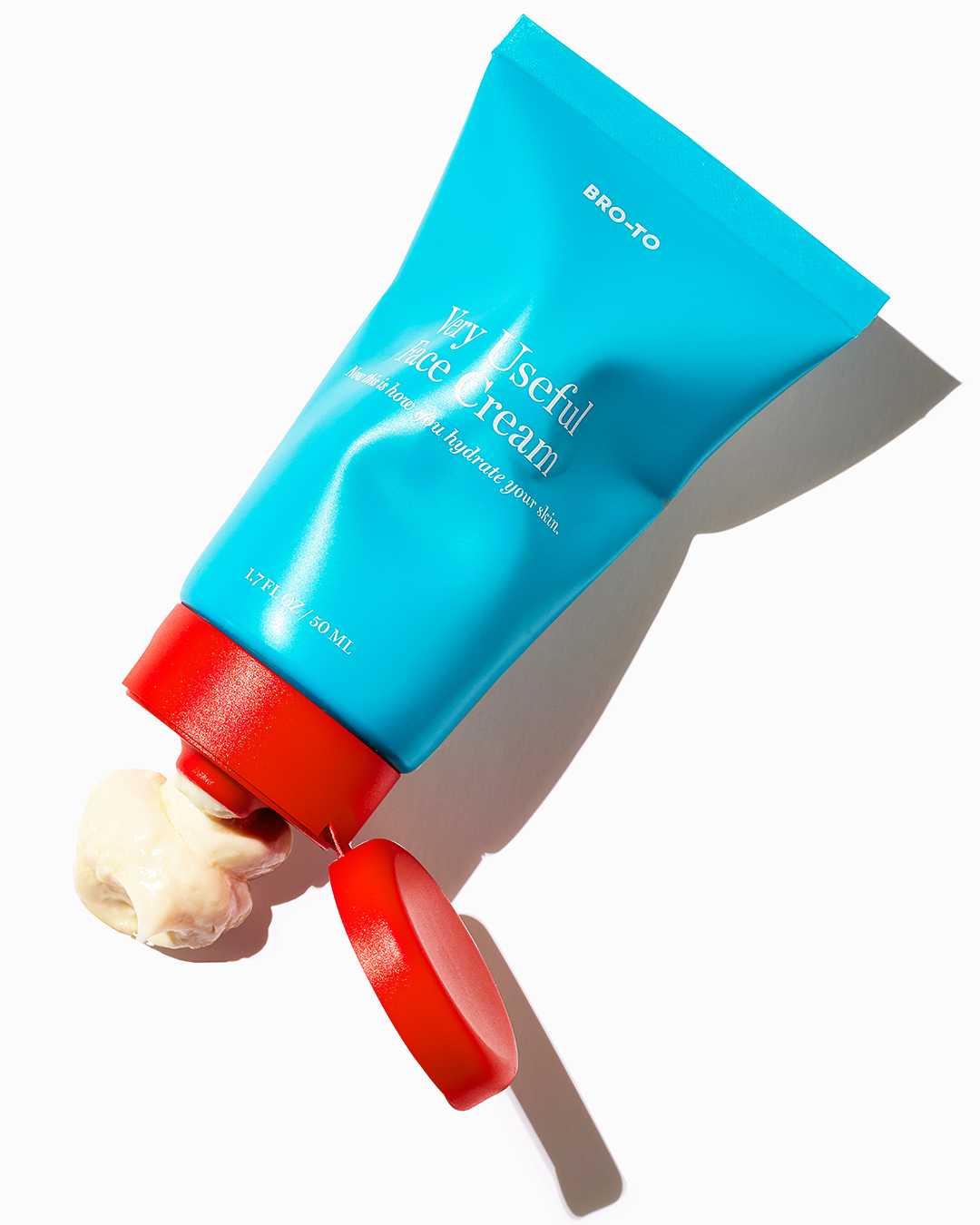
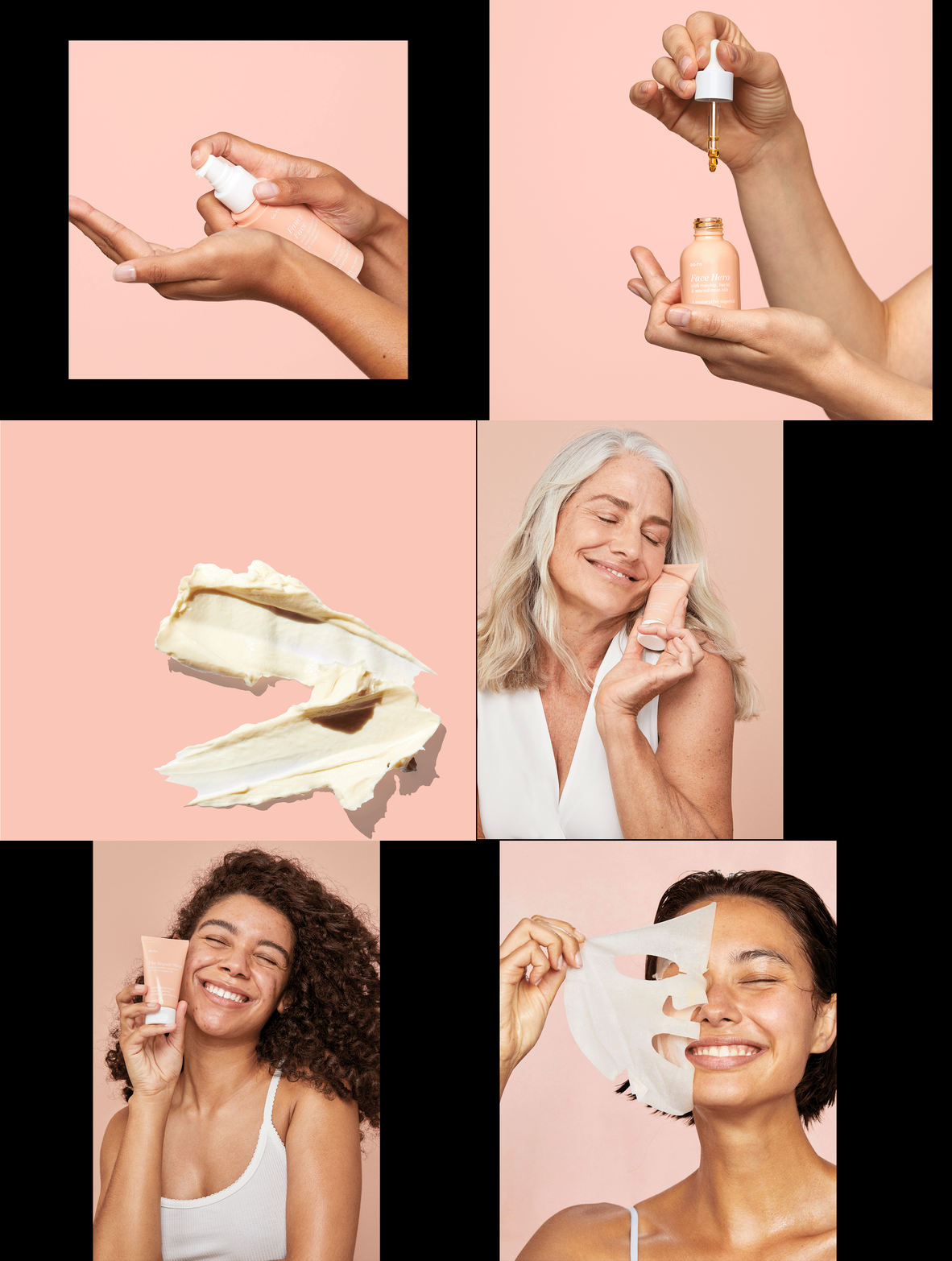
Shopalite and digital advertising, infused with the Go-To irreverent fun to increase brand awareness.


Working with UX/UI designer Felicity Ieraci and the Go-To Skincare team on the re-platforming of the Go-To website onto Shopify. The platform move was so future marketing campaigns could be quicker to execute, and to give greater flexibility to copywriters / content editors.The goal was to be transparent with customers by simply and clearly showcasing the ingredients and product benefits and refresh the brand to ‘grow up’ the look and feel to reflect its maturity at being online and in business for five years.
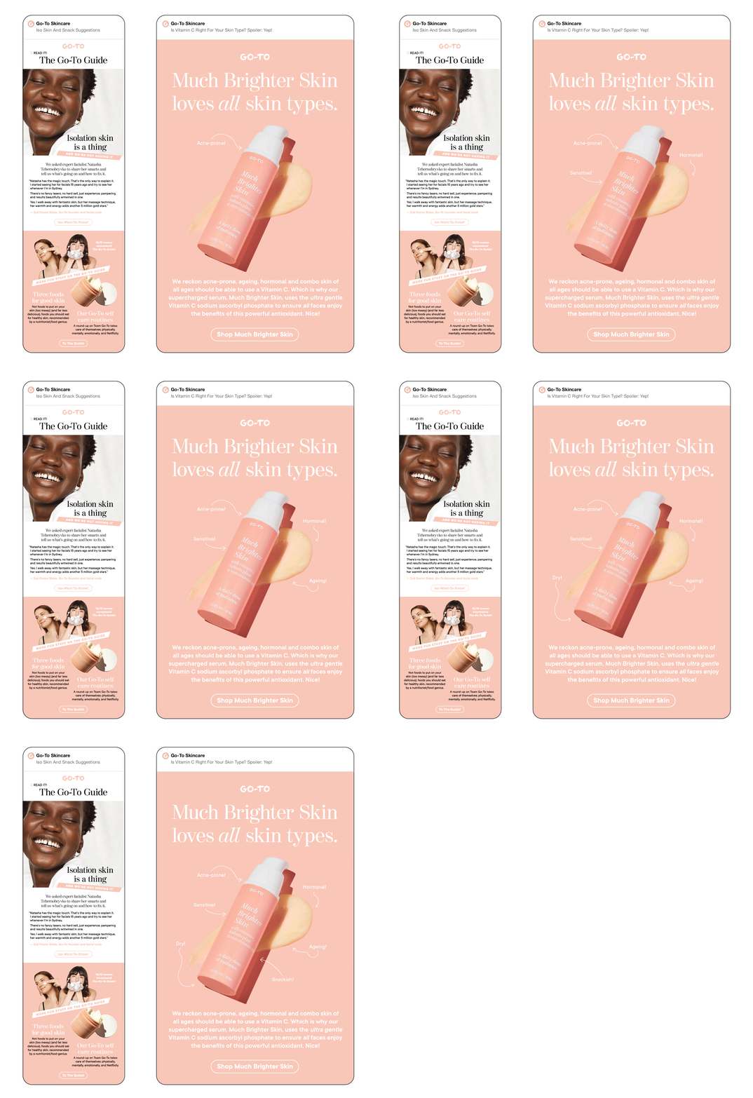
The refreshed branding and styleguide was rolled out across all facets of the Go-To communication including eDMs and social.


