The Locals Market
All about the locals.
Scope –
Art Direction
Brand Identity
Bespoke Typography
-
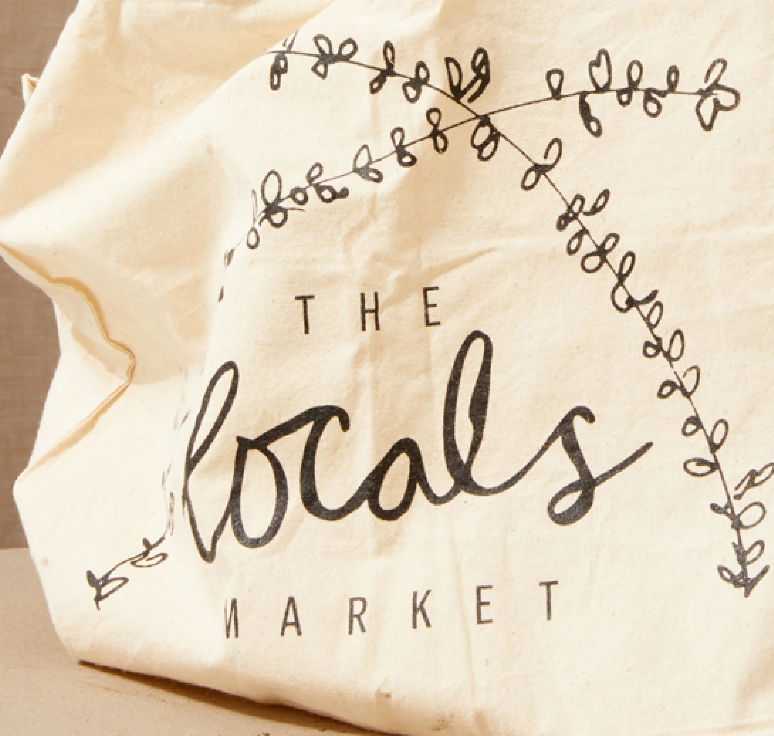
The Locals Market supports local producers, gives back to the community and ultimately provides beautiful, fresh seasonal produce weekly from the market to you. To infuse this personal, community-minded nature into the branding, a hand-drawn font was created as the backbone of the logo, along with some naïve illustrated thyme leaves creating a shelter above the wording.
Ever evolving, the branding is used with or without the thyme leaves. Simple and thoughtful. Just like The Locals Market.


The Locals Market, putting fruit and vegetables in the spotlight since 2013. A hand-drawn font was created as the backbone of the logo for the word locals, along with some naïve illustrated thyme leaves creating a shelter above the wording. Ever evolving, the branding is used with or without the thyme leaves. Simple and thoughtful. Just like The Locals Market.


